Mobile POS Onboarding
1. Project Summary
Converge Mobile is a mobile Point-Of-Sale solution aiming to make payment more accessible and affordable for small merchants. Together with an affordable card reader, it turns a smartphone into a secured point-of-sale solution, which empowers cashiers to accept credit and debit payments anywhere, anytime.
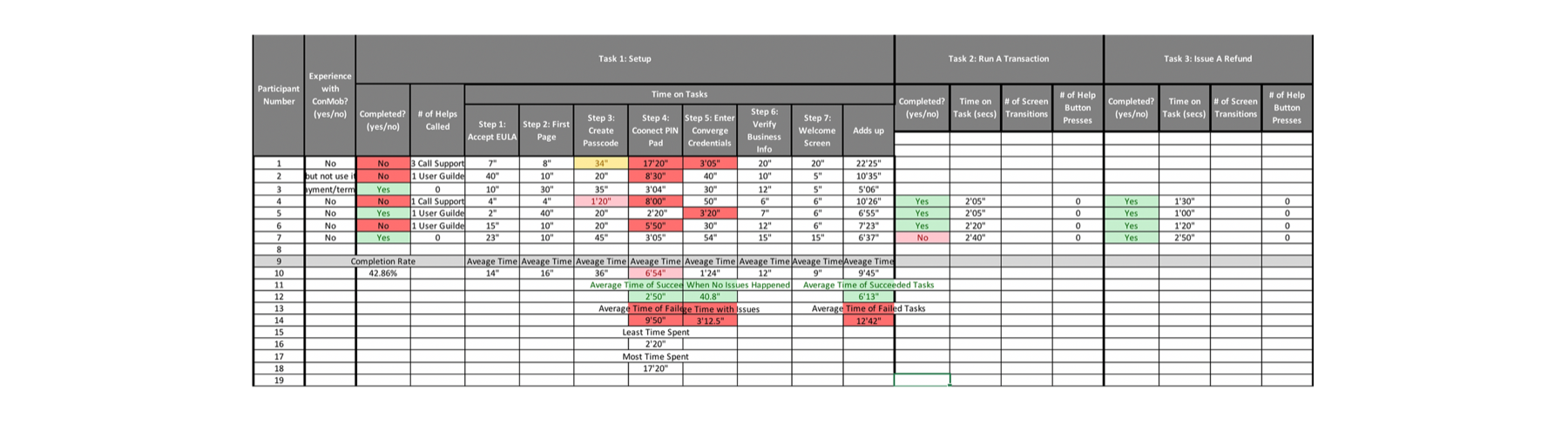
Our data showed that more than 50% of users failed to set up their merchant account during the first-time use (FTU) experience. So I redesigned the new user onboarding experience to help customers get up to speed. The new design increase FTU success rate by 20%.
2. Customer Problem
While being the lead designer on this product, I came across some data from our customer support center that roughly 50% of our users couldn't get through the first-time-use onboarding process, which resulted in
- Delay of customer value delivery,
- Customer frustration,
- Large call volumes in Help Desk,
- A high cost of customer operation.
3. Design Goals
- How might we get users up-to-speed with the mobile POS?
- How might we help users form a bond, build trust and confidence when using the product for the first time?
4. Design Solution
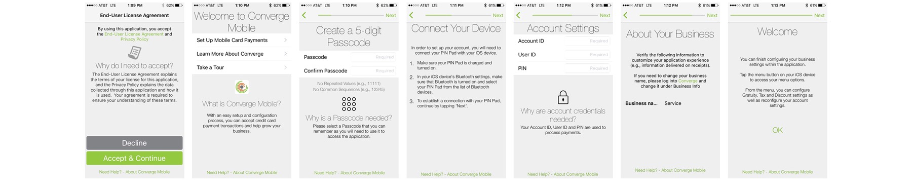
The Original Onboarding Experience
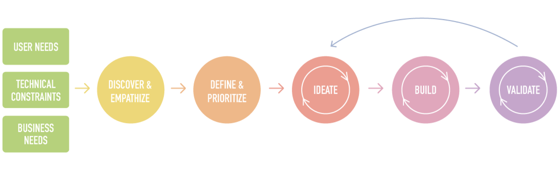
5. High-level Design Process
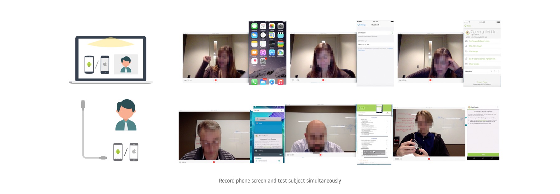
5.1 Usability Tests
I planned, coordinated and conducted several usability tests to identify aspects of our onboarding experience that cause confusion, difficulty or misunderstandings on users. The issues revealed in those sessions revealed the gaps between user's expectations and our product's UX, and shed light on design opportunities to improve the efficiency, usability, learnability, aesthetics of the product.
5.2 Performance Metrics
- Task Completion (Yes / No)
- Time on Steps
- Number of Help Requests
- Subjective Evaluations through a post-test survey
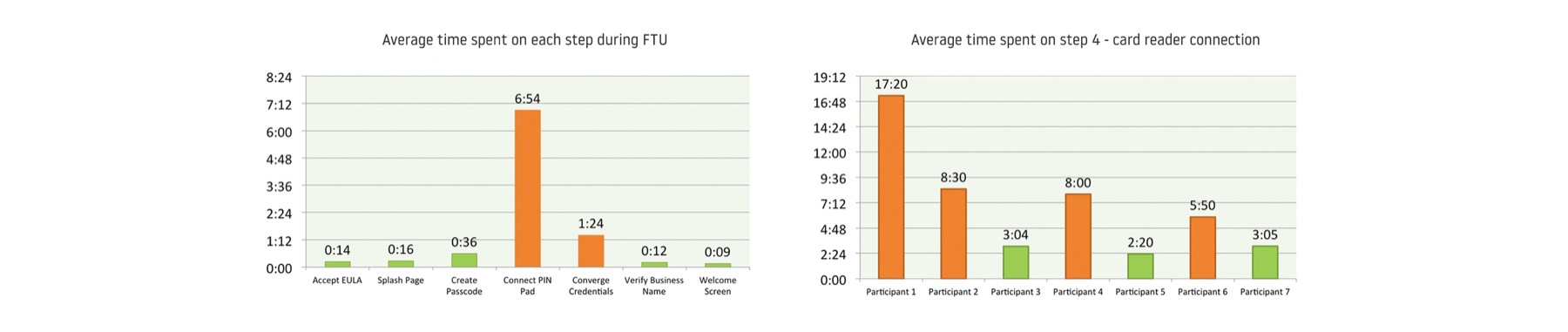
5.3 Quantitative test results
5.4 Qualitative test results
"Who read this (end user license agreement)? I will do what I would do — hit accept without read."
"I assume that’s it (the correct device)? But I don’t know, there is no way for me to know this is the correct device or not…"
"The phone internet connection! Well, WiFi might be a much obvious term…hmm…I don’t know…If it indicated my phone, I may have a better idea."
"At this point (after trying 15 minutes to connect the Bluetooth card reader with the app), I feel I’m not that smart.” with an embarrassed smile.
"Ah, you know what? Only now I realize the green bar at the top is a progress bar, now I’m actually at the end. I didn’t notice that until the last step."
5.5 Key Research Findings
We approached onboarding as more of an afterthought. We neglected the first mile of the product experience, and didn't get users where they need to be effectively and efficiently.
A. Failed to set expectaion with users.
To have the app work properly, users need to meet the following prerequisites: a valid merchant account, a supported card reader and Converge Mobile app downloaded on a smartphone. However, in reality, some users started the process without everything at hand. They ended up wasting the time and being frustrated. "I haven't received my card reader yet!" It's a clear sign that We didn’t set expectation with users on what they need to complete the onboarding process.
B. We have little control over the Bluetooth device pairing process.
The pairing process takes place in the phone’s generic Bluetooth Settings. Thus, we have no control over the process, and even no visibility on the connection status. If users run into any trouble, we have no clue there is a problem, or what the problem is; and we even don’t know whether it is paired successfully or not until users press on “Check Connection” button.
C. We threw a list of incomplete and unclear instructions at users and disappered.
Users have to consume overwhelming information on their own, and juggle between the mobile POS, Bluetooth Settings and the card reader to perform the steps.
D. Lack of visual consistency, hierarchy, and aesthetics.
The user interface was very text heavy. There were quite a few different fonts, font weights, font sizes, font colors used across the app, which created visual chaos and inconsistency.
6. Design Principles
Defining design principles is a key step in my design process. After gathering information and synthesizing insights, I craft design principles to establish my point of view and build alignment with my teams.
6.1 Guided discovery
It is not enough to just tell users about the product features, or what they need to do, but to guide them to make meaningful accomplishments.
6.2 Integrated & embedded pairing
In order for us to have more visibility and control over the pairing process, to provide contextual instructions to users, the Bluetooth pairing process should be integrated into and embedded in-app.
6.3 Just-in-time instructions
We should provide help that is never too late so that users have no clue how to move forward, nor too early so users have to keep them in memory.
6.4 Be clear & specific
The communication should be clear and specific (e.g. device type, connection type, how to interact, etc.); and the app should be responsive and transparent on app & device states.
6.5 Be simple, approachable & delightful
Most of our users are mom and pap shop owners, who are not tech-savvy, so the app should not be overwhelming or intimidating. We want users to feel it is warm and friendly, and by the end of the onboarding experience, they can have the confidence to learn on the go.
7. Redesign of the Onboarding Experience
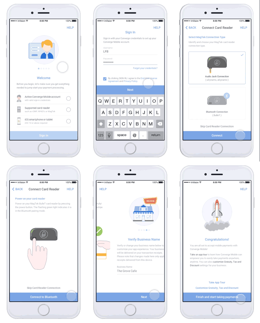
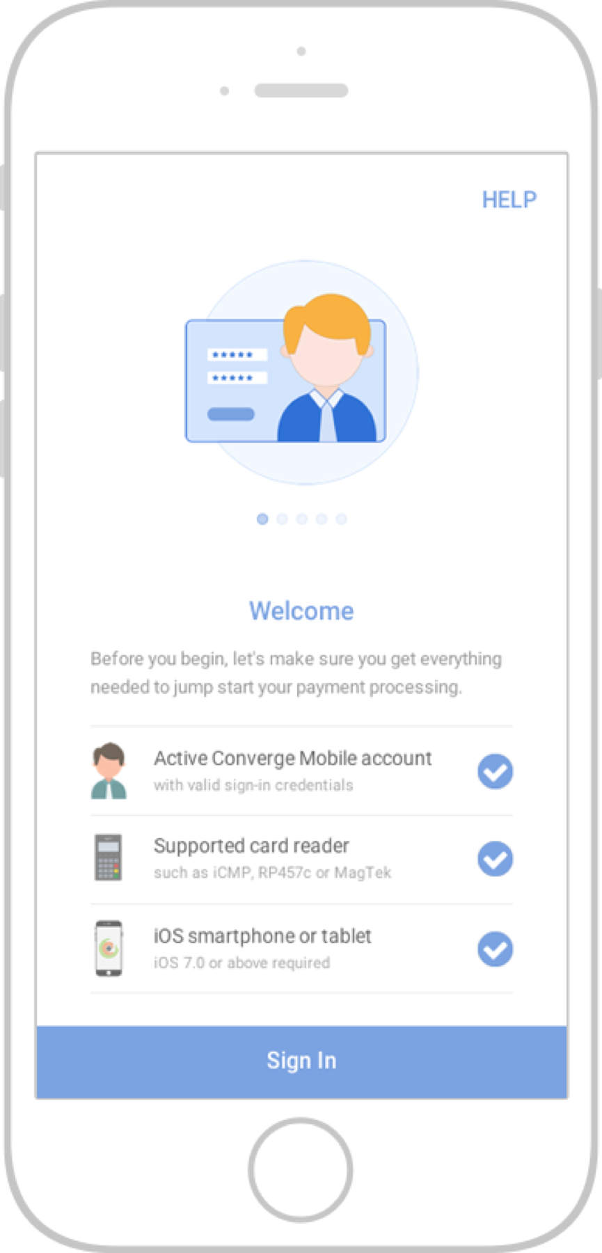 Change 1: Adding a Prerequisite Checklist
to make sure users have everything they will need before spending time in the configuration process.
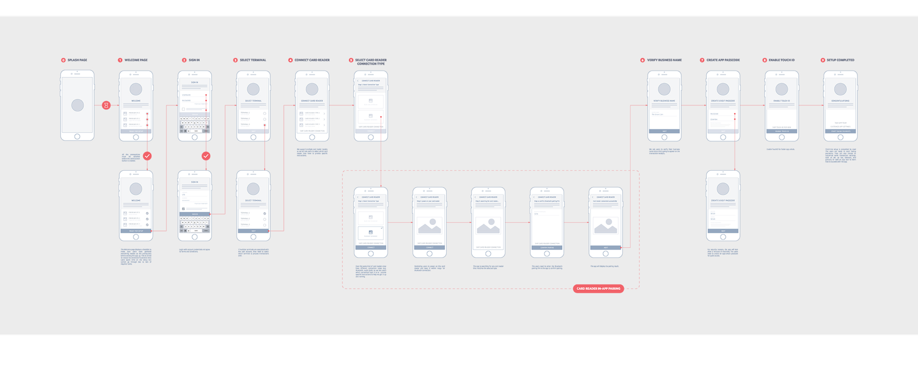
Change 2: Re-architected Onboarding Experience
- Are there any unnecessary steps in the onboarding process? What would be the shortest path to the AHA moment?
- How might we order those steps in a better way?
- Which steps lead to the greatest fall-off?
We brought the most problematic step - Card Reader Connection upfront, to put the biggest hurdles in the front, so if the users were going to fail, they would fail early, instead of spending time to go through most steps but fail to complete the last step.
Change 3: Enabling Card Reader In-app Pairing
The biggest pain point revealed from the usability tests is card reader connection, due to:
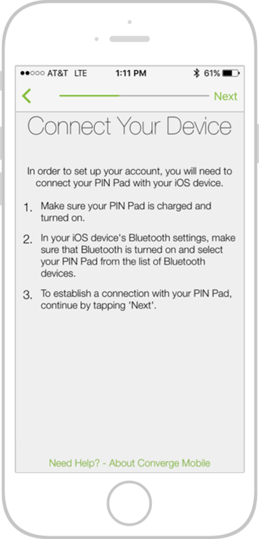
- One set of instructions for multiple card readers with different connection types.
- Unclear, incomplete, disconnected and misleading instructions in the app and on the card reader.
- The app is not very reactive to user actions and lack of visibility in card reader status.
- Unvalidated assumptions about user persona.
- The card reader is not intuitive/easy to use in nature.
The app didn't show the pairing result after a connecting attempt was made. Comments like “I think I’ve paired it?” clearly showed that users were deducing a conclusion indirectly rather than being informed of a certain status.
Considering our target audience is not tech-savvy, we will hand-hold them through the configuration process step-by-step, with expressive visual guidance rather than pure text-based instructions.
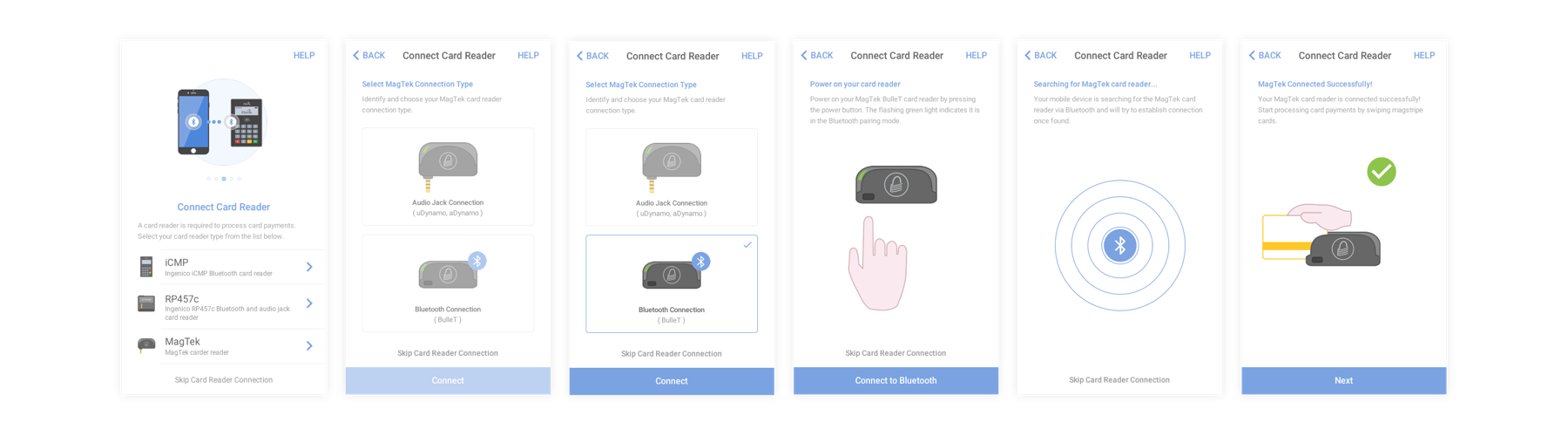
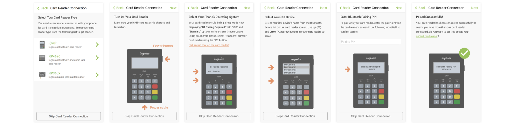
Change 4: Adding Self-explanatory Illustrations and GIF Animations
In order to make our app more approachable, learnable and expressive, I created self-explanatory illustrations, to communicate what exactly users should do and what they can expect from each action.
Change 5: Incorporating Touch ID.
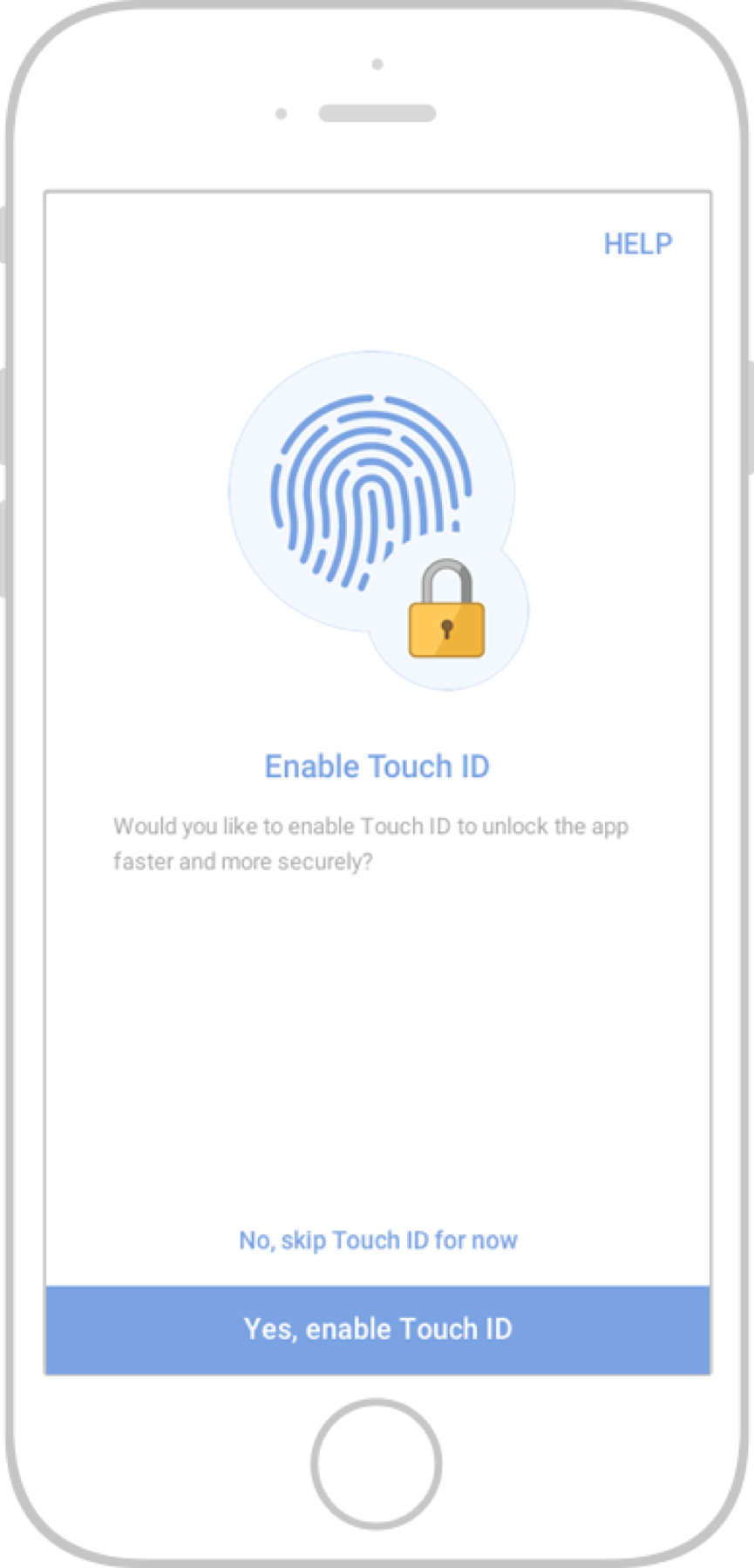
To put the Burden on the System, rather than on users, I championed the team to adopt new technology to provide a better user experience.
Change 6: Ensuring Consistent Visual, and Interaction Design throughout
I conducted a UI audit to surface inconsistencies in the app's UI components, voice and tone and interaction models. Those inconsistency breaks user's expectation of the app's behaviors, sharpens the learning curse and increases the chance of human error.
I refactored and standardized the UI for each page, which turned out as the initiative to build our design system.
Change 7: Refreshing the App's Theme
The app's primary color is "grass-green" chosen by a third-party design agency initially. However, we found out through research that this green doesn't provide enough contrast between the background and content. And considering the context of use, this could be very problematic for outdoor usage like food trucks. Therefore, I proposed to change the primary color to a blue tone, which also matches the characteristic of banking and payments - trust and safety.
Sample of Shipped Experience
8. Style Guide
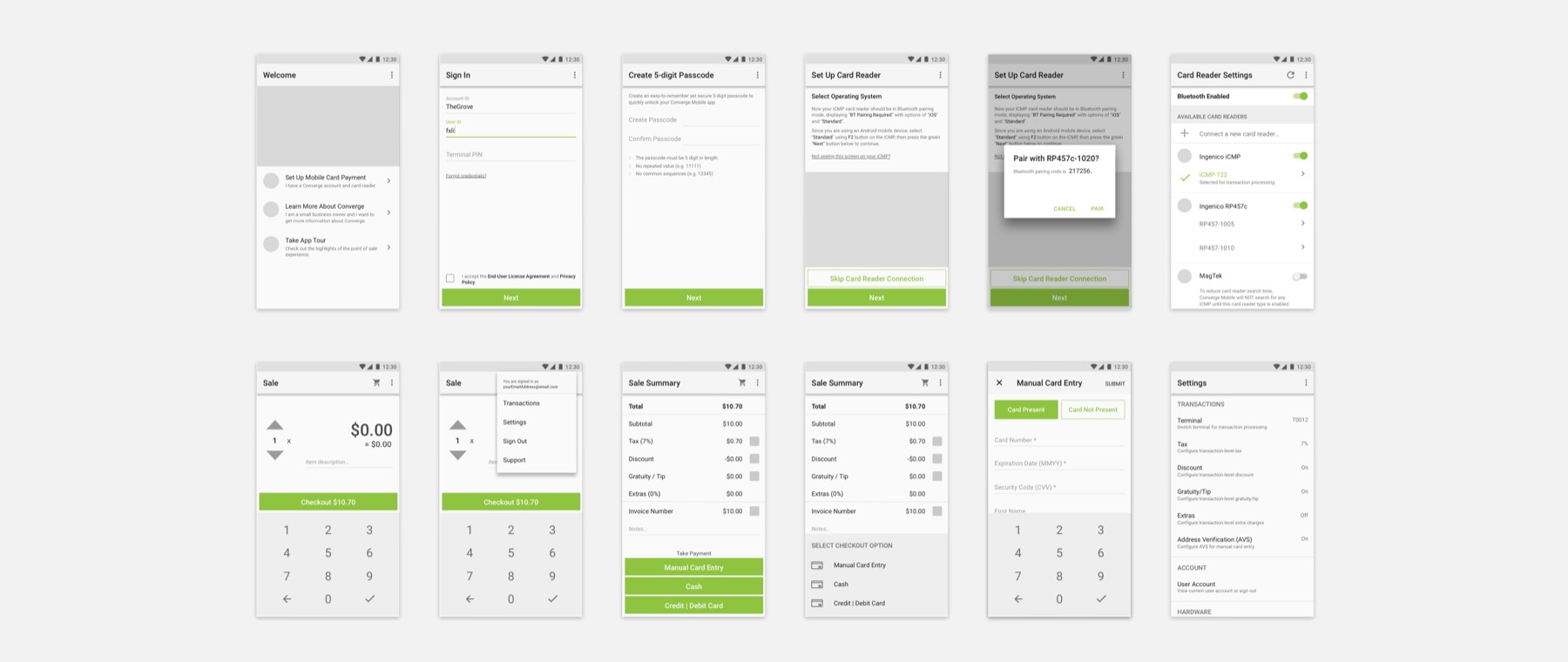
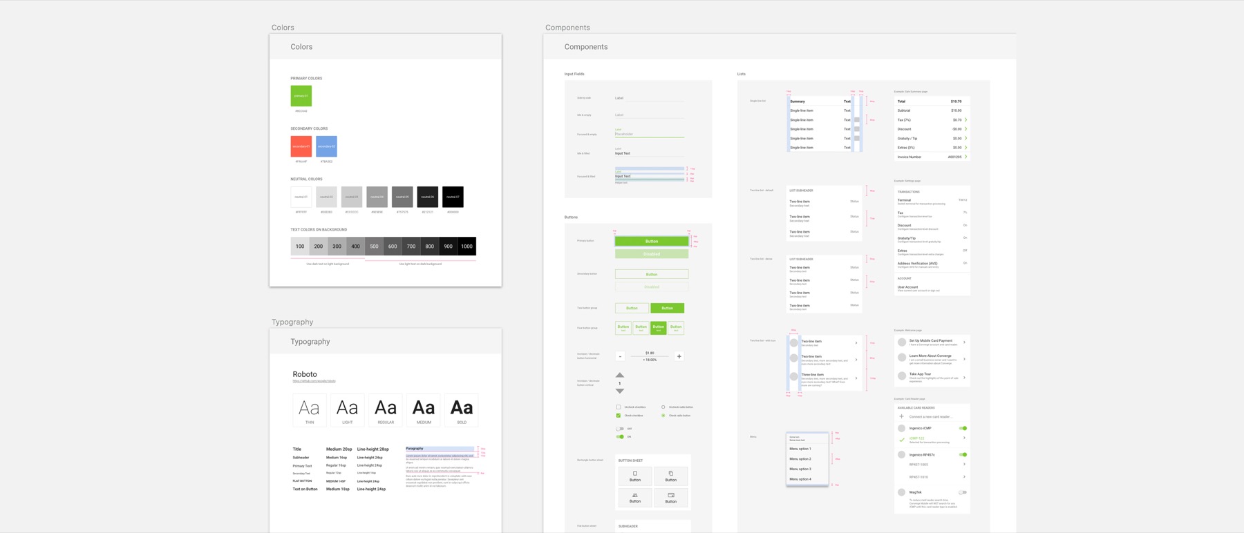
As teams and projects grow, our iterative and collaborative design needs to scale while generating predictable, consistent user experience. The needs of a common design language, a collection of reusable components, and a set of principles to guide the use of the components started to rise.
I conducted a comprehensive UI audit on the mobile POS solution, through which captured all UI elements and their states in our product and how they were being used. Then, I used Sketch to organize the colors, typefaces, UI components, patterns and templates and how they should be used. This work is still in progress and I will continue sharing what I am learning.
9. Impact
- The first-time onboarding success rate increased by about 20%, according to Mixpanel; besides, the average time during usability tests reduced from 6’55” to 2’17”.
- Along with the in-app onboarding experience redesign, I also created a Quick Start Guide that goes into the physical product package, which helped users with the unboxing experience and reduced Call Center volume for onboarding issues.
- Led the initiative of building our design system and design language.
- Established trust through delivering user outcomes and business goals in the multidisciplinary team, helped the business to understand the value of UX and how it can tie back to the business strategy.
10. Reflection
- We should consider the end-to-end user experience, not just the moment of consumption. It is before, during and after. Nobody cares about the thing you’ve designed, unless you can get them past the beginning.
- Product experience is not just the in-app user experience, it involves the holistic product landscape including branding, onboarding, interaction with the brand employees, etc.
- We will probably meet people who challenge or question our work. Be thick-skin. Take the stance for what you believe is true and right (make sure they are actually true and right), and fight the good fight. Take the initiative to push the boundaries and work towards the shared vision. Don’t settle.
- When presenting user research findings, don't just show statistical results like numbers, charts. Considering adding a video clip from your test recording to bring your audience along on the journey of the users. Seeing how they struggled and how their emotion changed from excitement to frustration will help build empathy for the users and gather support for your future design.
- Besides, I find it is not enough to just point out the problems. It can get people being defensive sometimes. Considering showing potential solutions, showing that we can get the desired user outcomes by making certain changes. People are more willing to accept suggestions when they see a clear path towards it.
- "A picture is worth a thousand words." When used properly, graphics and illustrations in your product will not only communicate and deliver the information more effectively to your audience, but also enhance the look and feel, and adding a moment of delight to build an emotional connection between your product and audience.