Amazon Shopping App
"My Account" page CX Vision
1. Project Summary
During Amazon's annual Operational Planning (OP1), I led a cross-functional initiative to generate a forward-looking customer experience (CX) vision to revamp Amazon retail app's My account page (aka. Me tab). I organized workshops to collect insights and inputs from UX researchers, designers, product managers and engineer leads, and developed the following CX strategies that were grounded in design thinking and user research, which ended up shaping our organizational priorities and roadmap for next year.
- Simplify overall My Account page information architecture (IA) with zones framework;
- Improve order tracking CX;
- Allow customers to resume previous shopping journeys effortless;
- Surface account-related Calls-to-action (CTAs) proactively;
- Add personality to the page to make it fresh and fun
2. Research about Current Customer Experience
I ran an unmoderated user study via usertesting.com to collect customers' impressions about My Account page and pain points. I also digged into our Customer Frustration Database to collect insights from previous user research.
Customer pain points
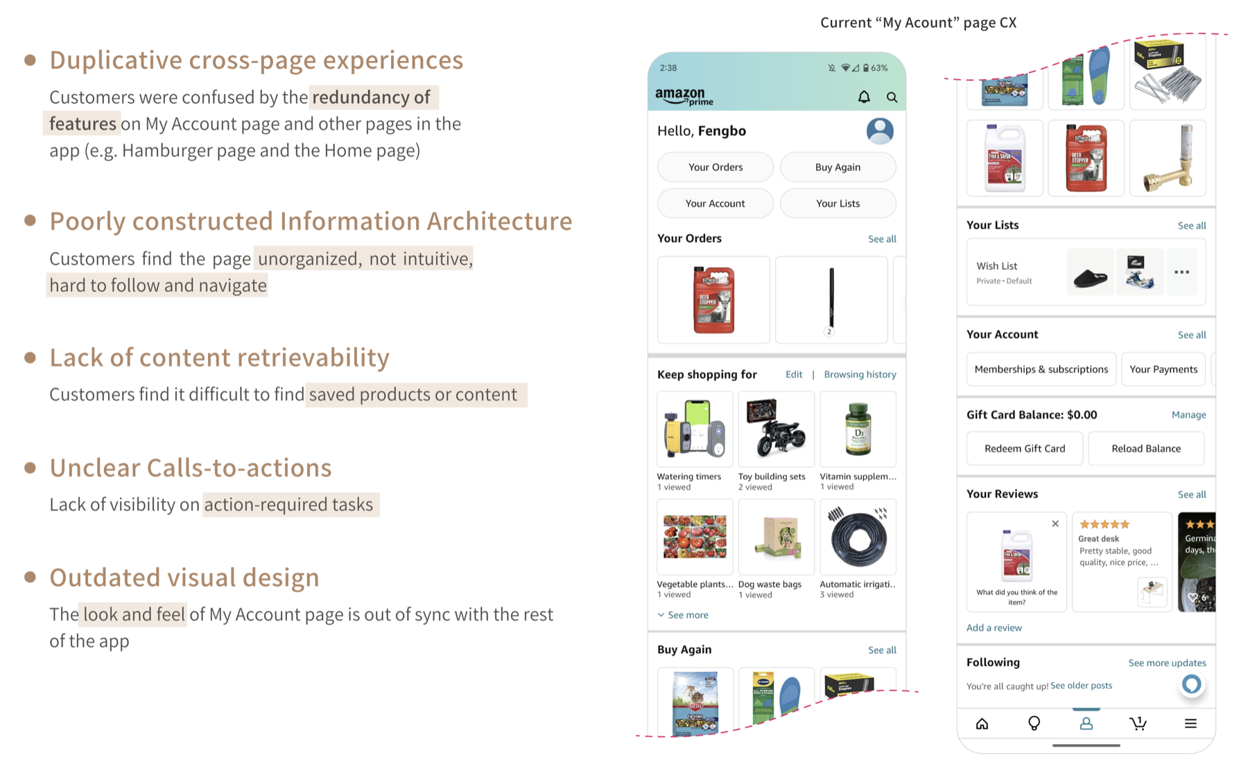
Customer quotes
"The page could be better organized...There are all these pages, all the tabs, all the settings. I feel like they're cluttered and it doesn't really explain to you what each one is for or how to use them."
"In Your Orders section, I find myself wanting to see just the delivered, shipped or late orders only. But there's no filter for it, so I have to scroll through all my orders instead. It would just be easier, if I didn't have to scroll through everything, just to see what I need to see. On average, I get multiple packages every day and they have different shipping statuses, so it would be nice to have a better way to filter all my orders."
"So we have Buy Again here (points to the white shortcut pill button at the top of My Account page), then we have orders (scrolls down), then we have Buy it Again here (points at Buy Again widget). It all seems a little pedantic to me."
Customer expectations
Customers expect a clean, well-structured My Account page that brings forward their live order information and account-related tasks across the Amazon app, organized in a way that feels intuitive.
3. Define outcomes to achieve via this redesign
We envision by redesigning My Account page, customers can:
- Navigate My Account page faster and effortlessly
- Understand their order status at a glance
- Have a clear idea of pending action items that need their attention
- Easily pick up where they left off from previous shopping journeys
- Find My Account page aesthetically pleasing and refreshing
Besides, we want to empower 30+ internal partner design and eng teams who are building features/widgets to:
- Clearly understand what goes where on on My Account page;
- Follow established design guidelines to ensure quality, cohesiveness, and scalability of the page.
4. Develop design strategies - the zones framework
4.1 Zones definition - How to restructure page content to match customers' mental models for easy information consumption and intuitive navigation
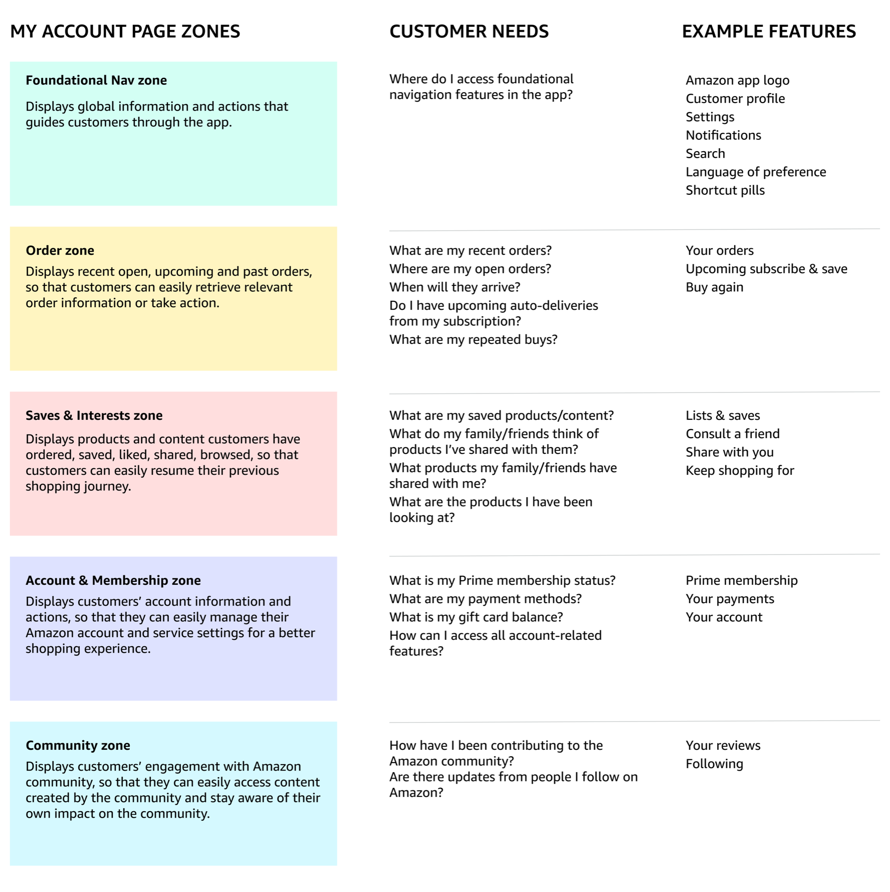
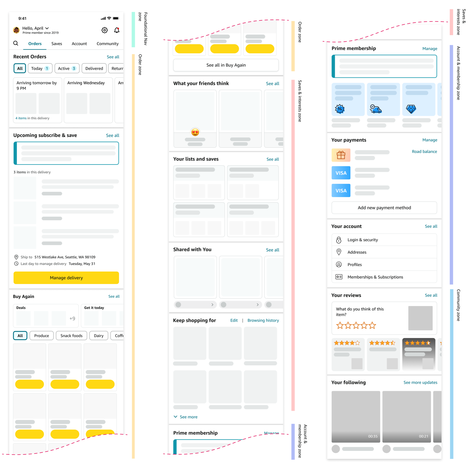
Zone is a framework that groups relevant content together based on customer intent. Each zone is dedicated to addressing specific customer needs/questions, matching customers' mental model and browsing behaviors. If a feature/widget doesn't answer that customer question, it doesn't belong to this zone.
I developed the following zones framework by looking across 50+ features/widgets on the page and conducting Card Sortinng exercises with customers.
4.2 Zones ranking - to provide a tailored experience to each customer
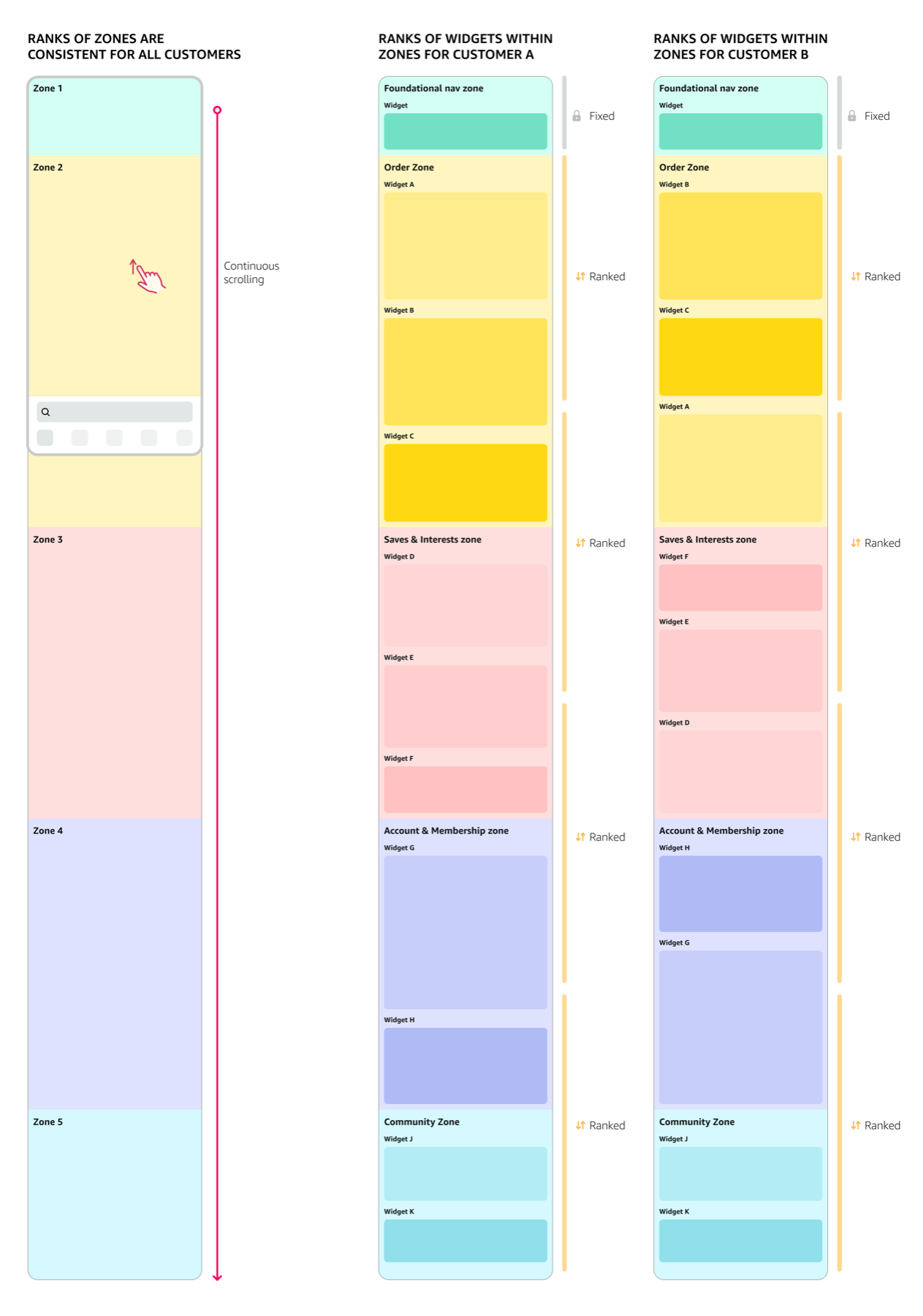
At the zone level, We believe the order of zones should be consistent, so that the overall page IA feels familiar and predictable. We will test different arrangements of zones and find an optimal order that best matches customers' expectation on how content should be arranged on My Account page.
At the feature/widget level (widgets within zones), we believe different customers use different features on a daily basis. Therefore, we will rank widgets within each zone dynamically based on conversion rate and customer engagement rate, in order to provide a personalized experience.
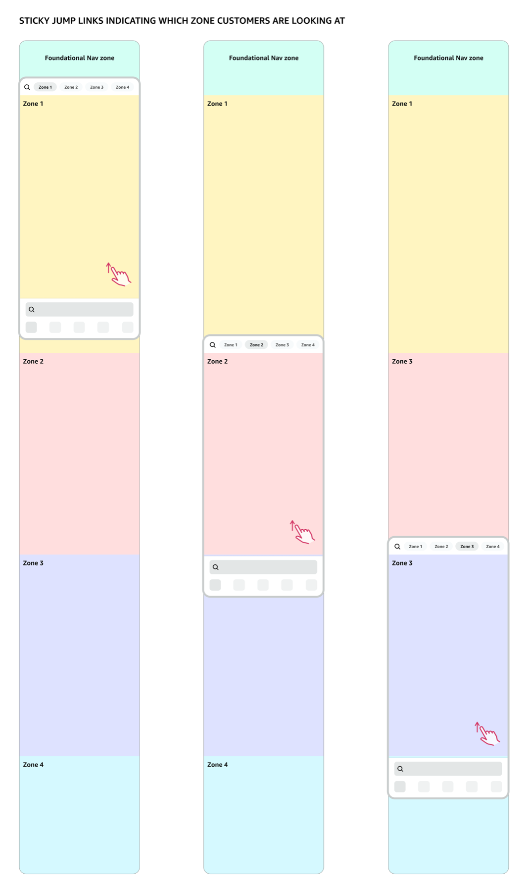
4.3 Zones navigation - with jump links
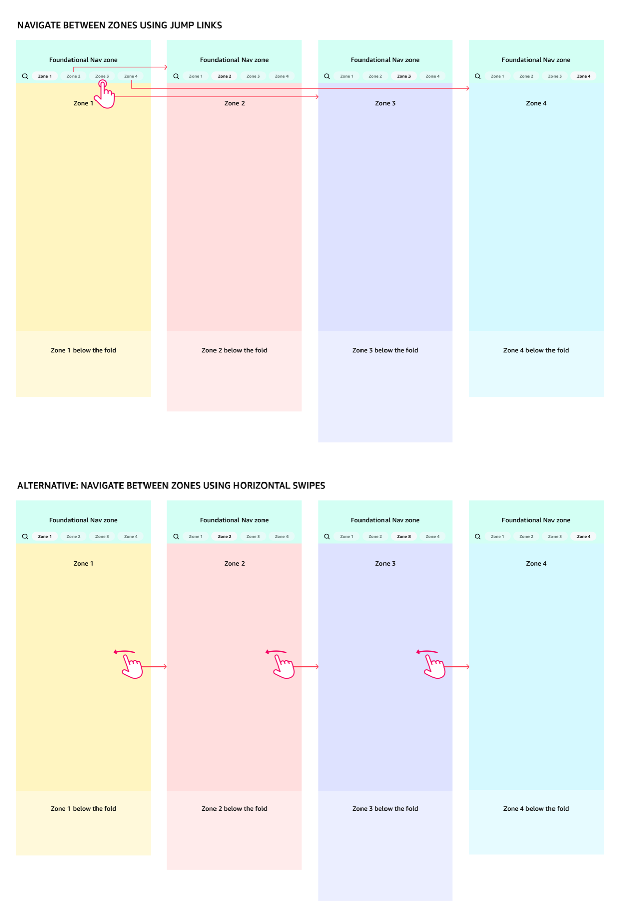
This navigation pattern not only give customers a shortcut to quickly jump btw. zones, but also helps customers form a mental model of what the zones are and how they are organized.
4.4 My Account page after redesign
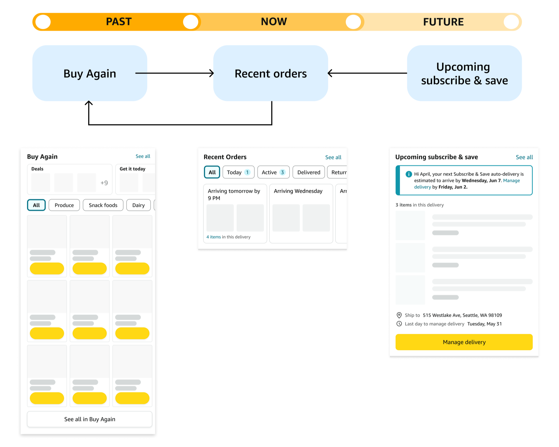
5. Order zone - Where customers can engnage with orders throughout their lifecycle
Order zone is a dedicated place for customers to check any order information, whether it's a live order, upcoming order, or past order.
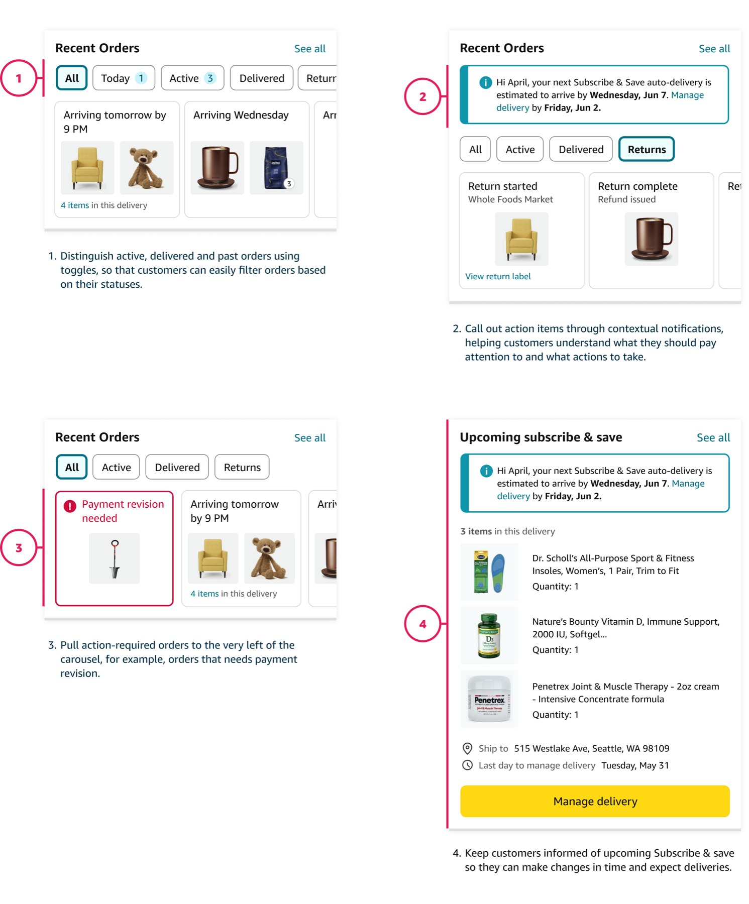
Redesign Your Orders widget to help customers easily understand order status and take actions when needed.
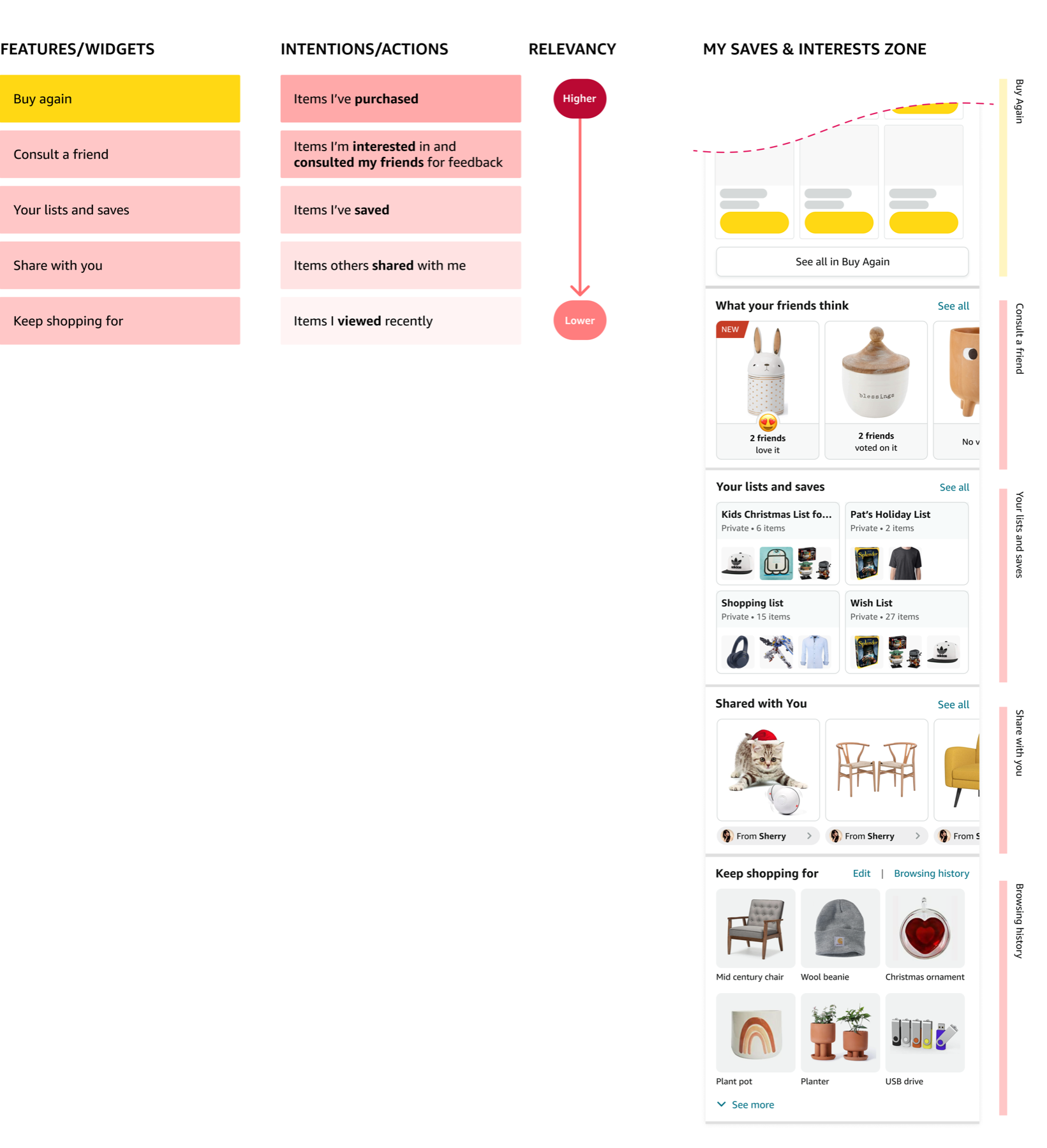
6. My Saves & My Interests zone - Help customers easily pick up where they left off from previous shopping journeys
We hypothesize having a dedicated zone where customers can easily retrieve products they have purchased, saved, shared, browsed will allow them to easily resume a shopping mission without having to restartt a search from scratch.
7. Standize Your Account page visual design
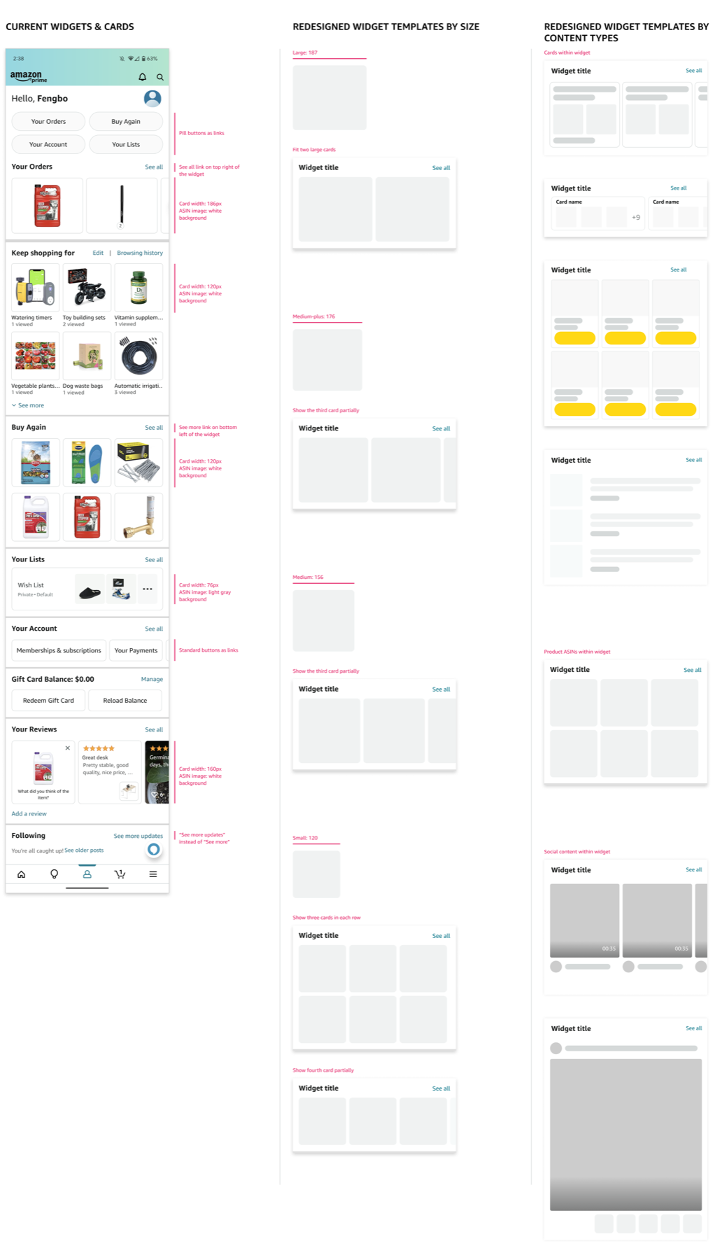
Currently, widgets and cards on the page have various sizes, shapes, shadows, border radiuses, spacing, background colors, etc., developed by different partner teams. This inconsistency adds to the visual chaos for end customers and hard to maintain for our engineers.
8. Results & Impact
By identifying gaps and opportunities in Your Account page architecture, I defined a long-term CX visionn including the zones framework to revamp our design. I successfully influenced the strategic direction of our product by proposing these concepts in Amazon's annual Operational Planning (OP1), and got buy-ins from cross-functional partners up to the VP level, eventually got these ideas priorized and funded for next year.