Web Point-Of-Sale
1. Project Summary
Converge is Elavon's omni-channel Point-Of-Sale (POS) solution which enables merchants to accept online, in-store, telephone and mail payments anywhere, anytime. I worked on this project as a product designer from 2016-2018. During this time, I led redesign of the merchant experiences including taking payment, managing customers and users, and sending invoices and receiving payments via bill pay.
2. Customer Problems
By looking at product analytics data in Mixpanel, conducting customer visits/interviews, and talking to customer support representatives, I identified a few common themes of customer problems we need to address in order to elevate the experience for merchants.
- Inefficient payment flow and Unreliable POS system: our users are small-medium-sized businesses, who are super heads down trying to take care of their customers with a pleasant end-to-end shopping experience. However, sometimes the payment experience is where the ball drops, for example people are waiting in line for a long time to check out, or the card reader failed to read credit card information, etc.
- Disconnected systems and isolated data: many merchants are using fragmented systems to run and manage their businesses. For example, they have a POS system to take payments, a CRM system to manage customer information and loyalty programs, an invoice system to bill customers, a web hosting service to run online store, an employee management system, a taxing and reporting system, etc. These lead to extremely inconsistent experiences and merchants lose the rich data that could be used to generate sales and operational insights.
- Emerging needs from a merchant as their business grows: when a business grows from a one-man shop to one with a few employees, from a single store to multi-locations, from one terminal to multiple POSs, from selling a few products to multiple categories of products, new business needs emerge, they need other solutions to solve new business challenges.
3. The Design Goals
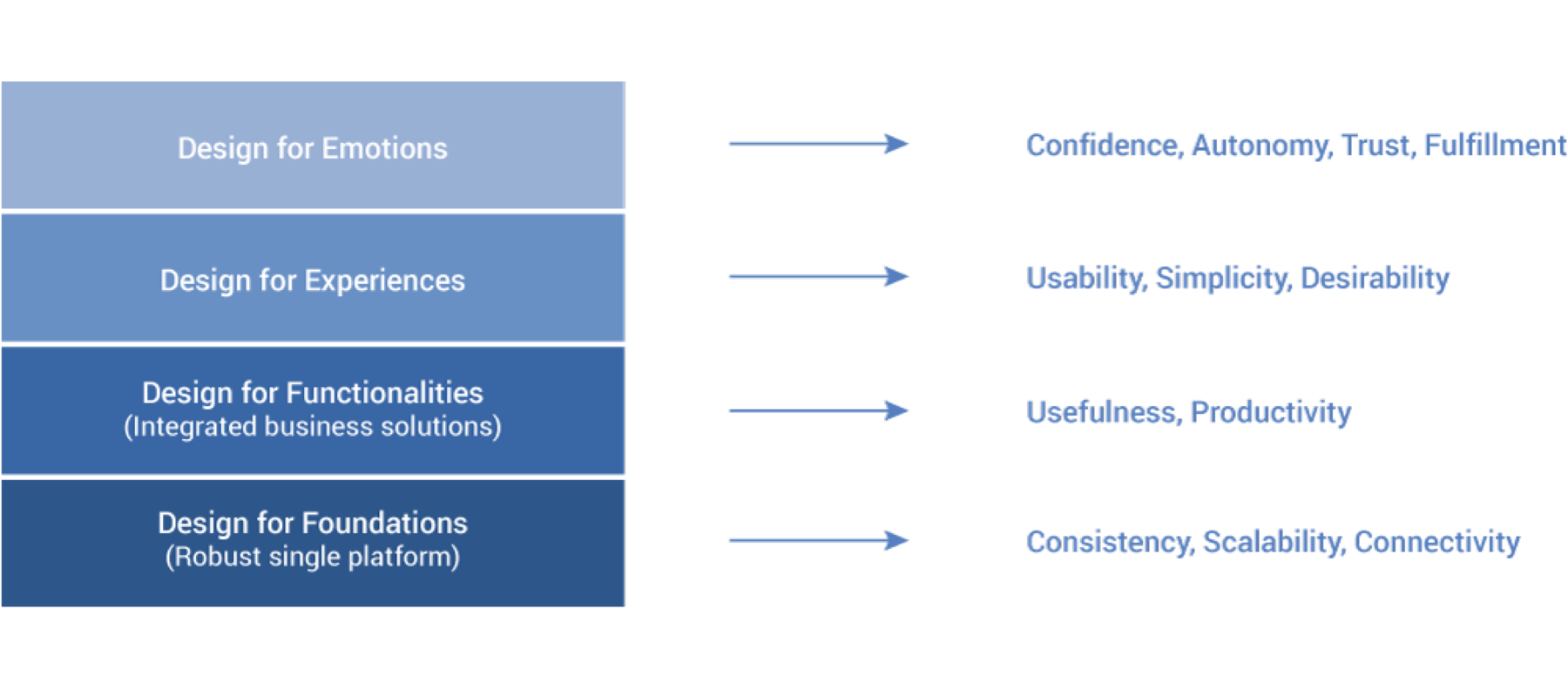
How might we design a single platform that integrates merchants' various business needs, empowering them to take payments productively, to drive sales and revenue, and to provide a better shopper experience for their customers?
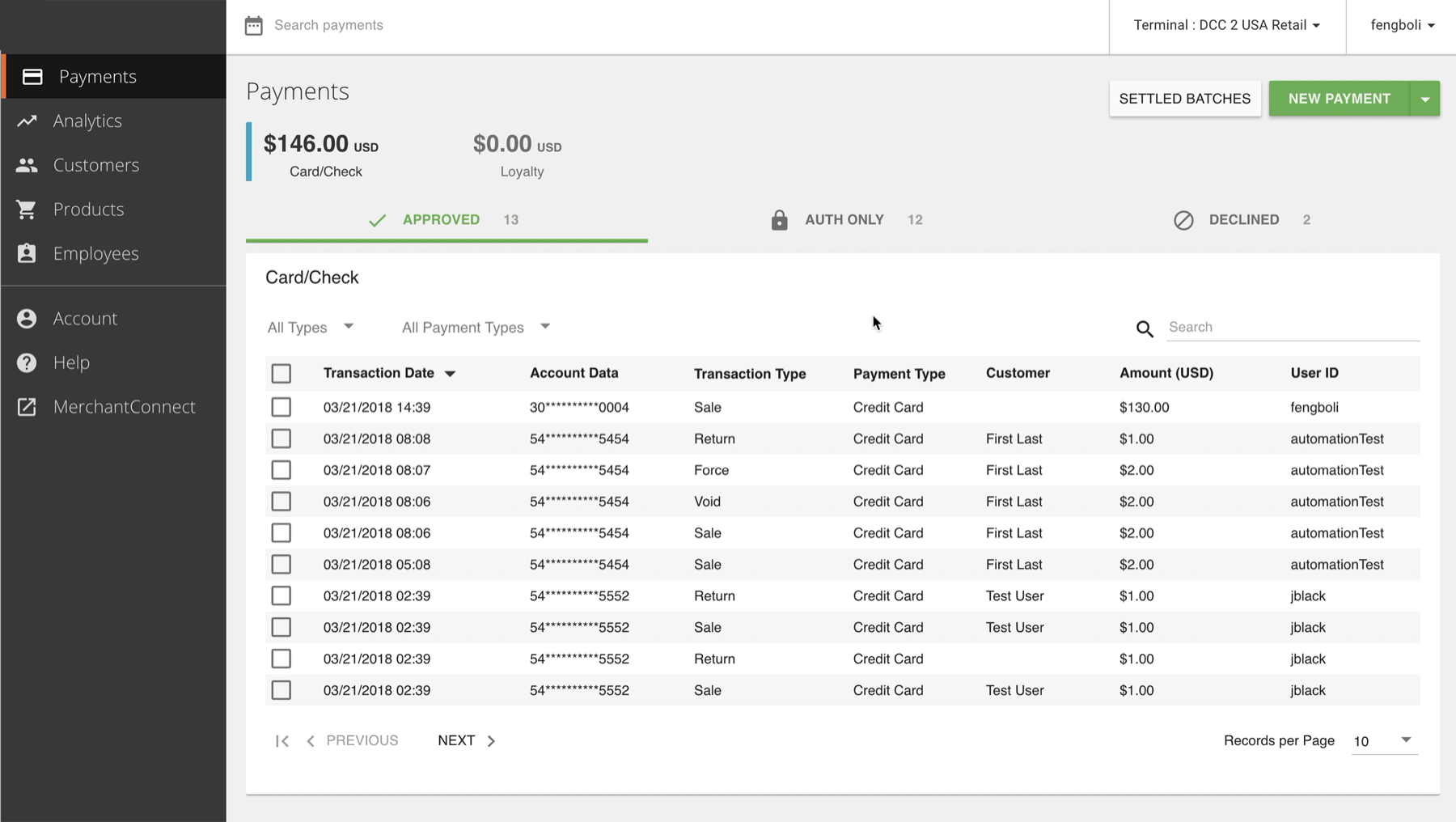
The Launched Product
4. Research
A. User interviews & contextual inquiries
We started with user researches to investigate, observe, interview, and learn about our users. Via human engagement, we gained a better understanding of their needs, wants, goals and motivations, learned how they interact with our Point-Of-Sale systems and the context of usage, we better empathized with their pain points and the values we can bring into their lives.
B. Usability tests
In order to discover where are the gaps between user needs and our product experience, I also conducted usability tests. To measure the quality of the user experience, we adopted the HEART framework. Since our product is maily task-based, we focused on the Task Success metrics: once a merchant starts a new transaction, we want them to quickly and easily complete the sale without any errors.
- Performance Metrics
- Task completion rate
- Time on tasks/steps
- Number of test subjects ask for help
- Number of test subjects make errors
- How test subjects completed the task, compared with the designed flow
C. Examples of Key Usability Test Findings
C.1 The system reflects the underlying data model rather than users' mental model.
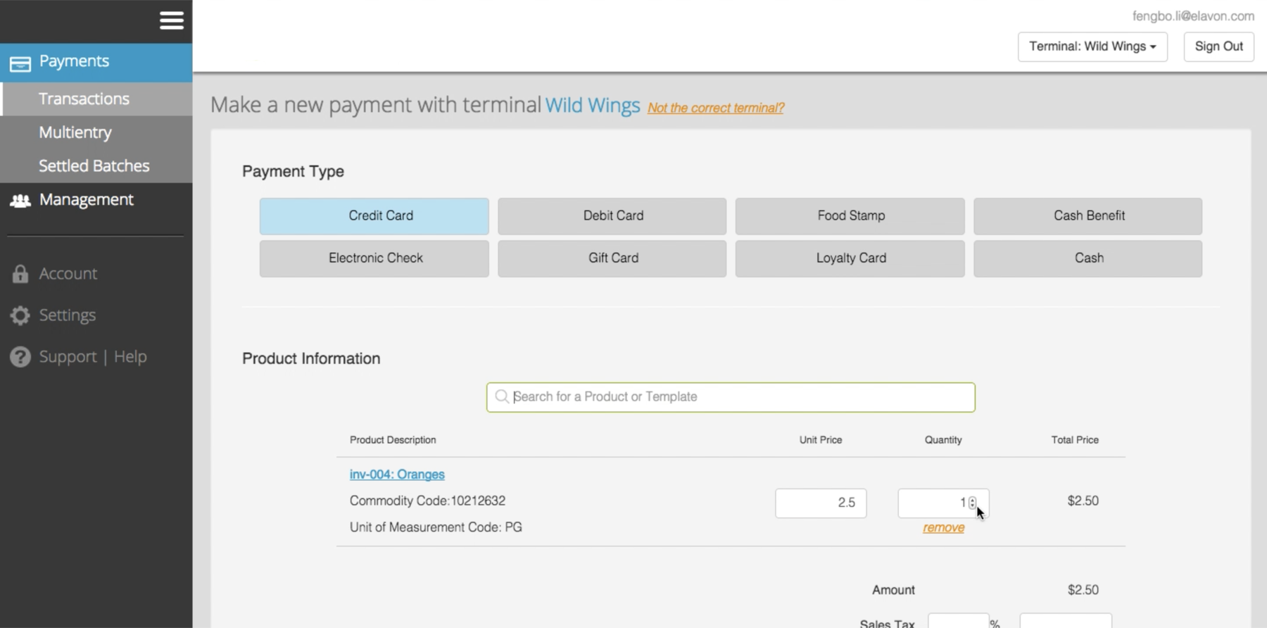
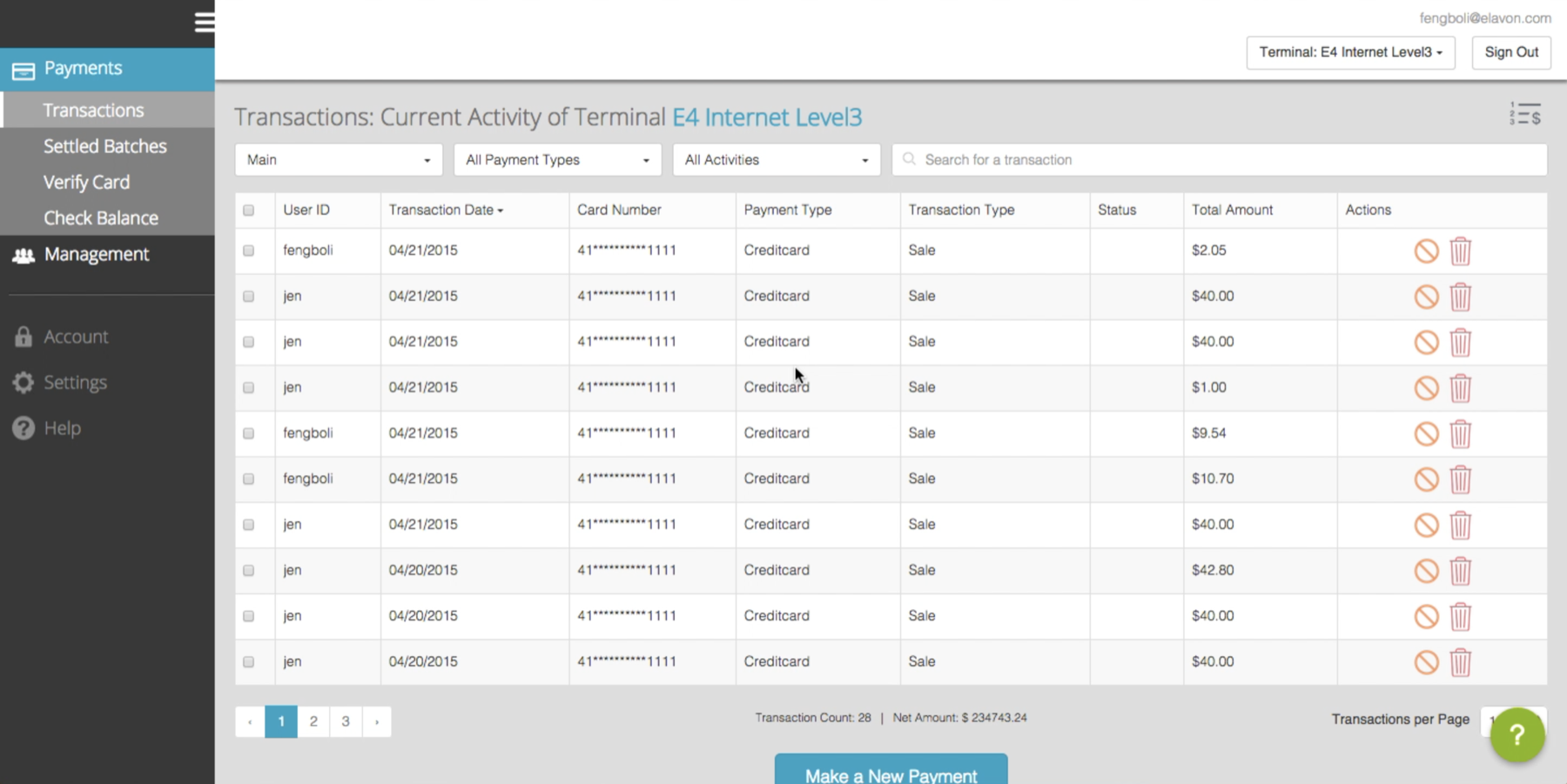
Instead of entering product/order information, our users need to input what payment type the shoppers want to pay with first. But the reality is, nobody will go up to a cashier and tell him how to pay before telling him what to buy first.
C.2 Dysfunctional navigation that doesn't follow conventions or conform user's expectations.
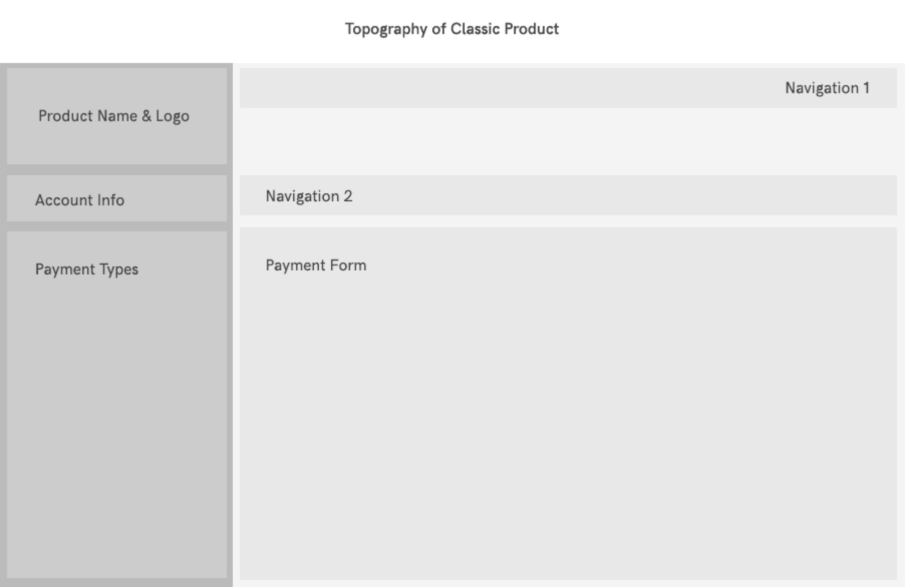
The classic product's left menu is the entry point for different payment forms, instead of global navigation (which is what users are accustomed to). As a result, users look for functions in the wrong place.
Jakob's Law of Internet User Experience: users spend most of their time on other sites. This means that users prefer your site to work the same way as all the other sites they already know.
C.3 Bad Call-To-Actions
- On the Transaction History screen below, the primary Call-To-Action (Make a New Payment) gets cut off by the browser window.
- Repetitive Call-To-Actions for each transaction in the table, which introduced both visual chaos and chances for user errors.
- Call-To-Action icons without labels were confusing and not universally understandable.
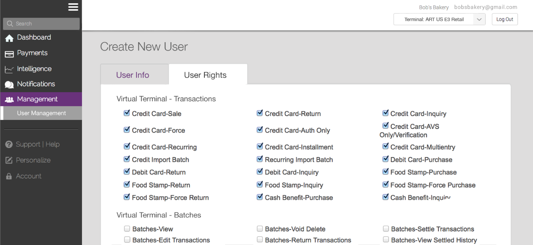
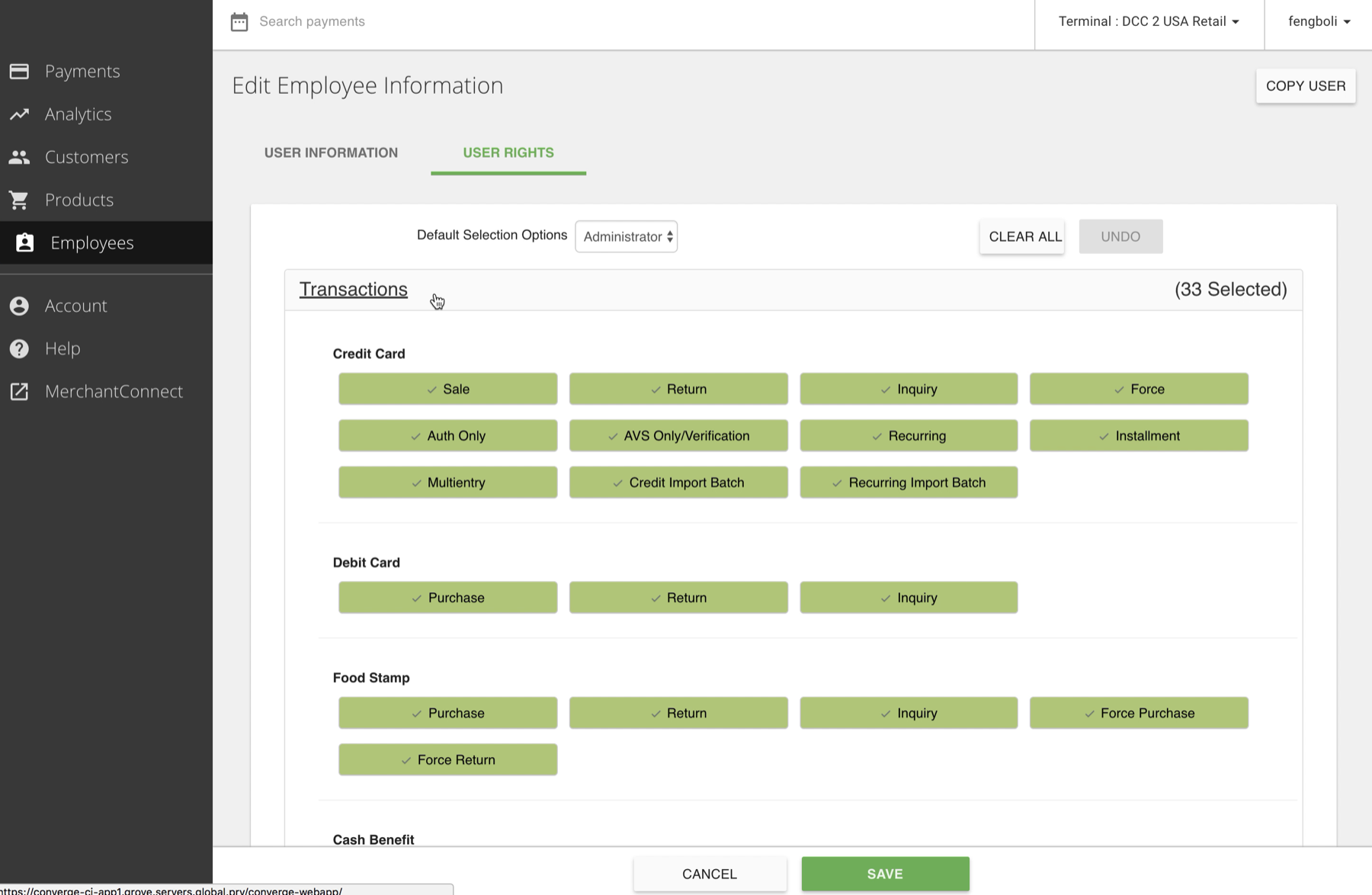
C.4 Lack of usability, readability, accessibility. In order to assign user rights, a user has to navigate through clustered checkboxes to complete the setup.
5. Synthesizing, Defining, Prioritizing
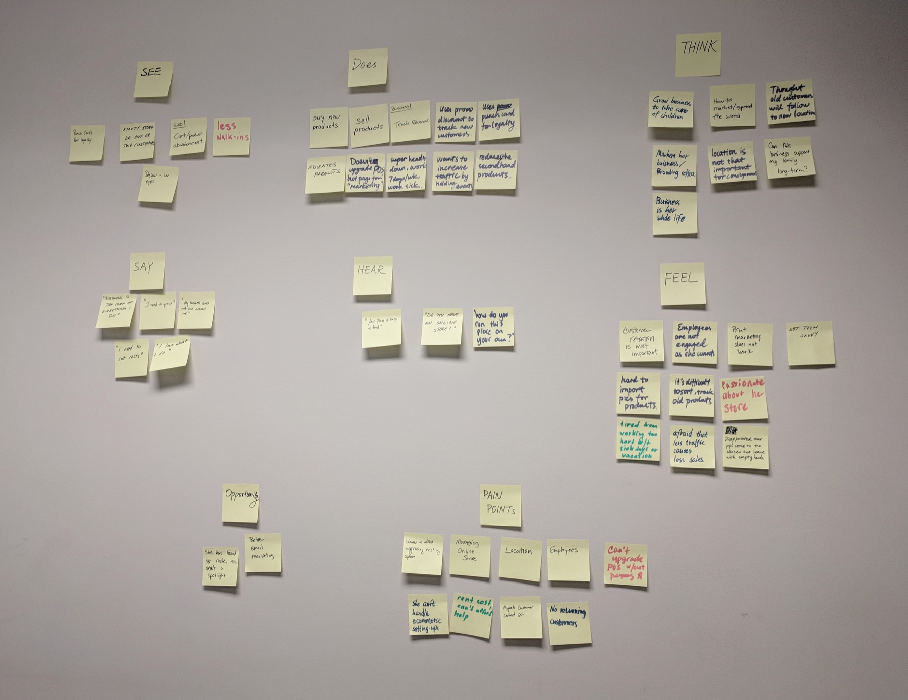
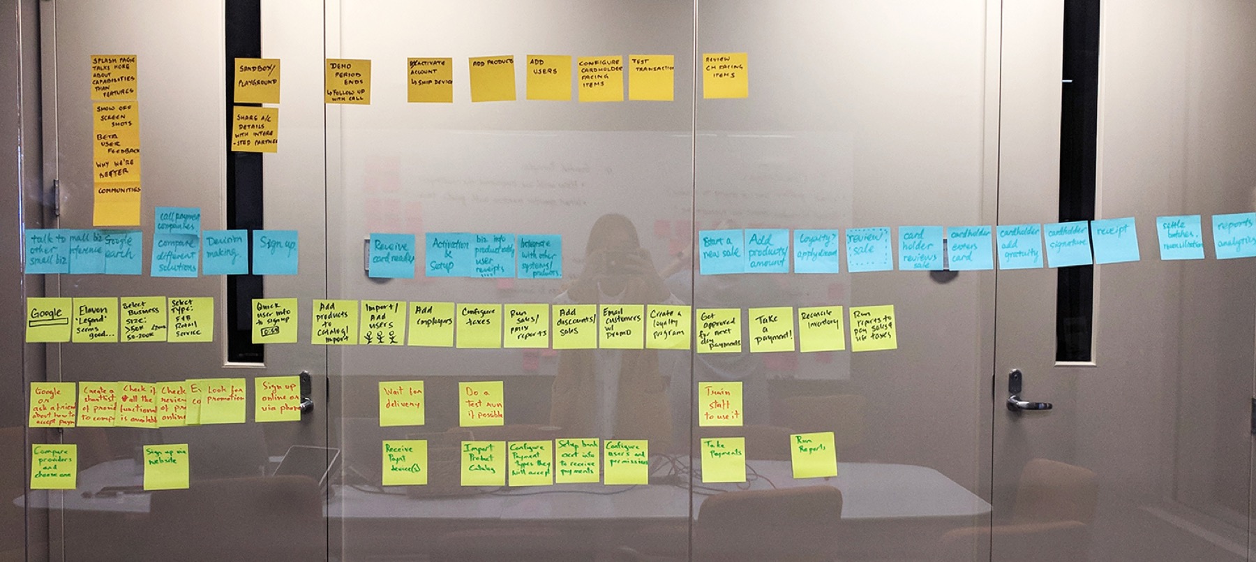
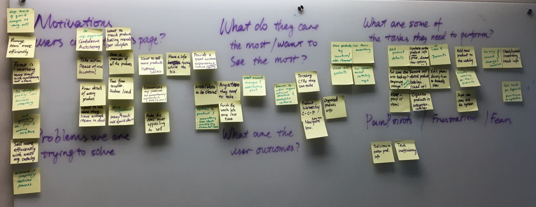
With insights gathered via human engagement, the next step is to turn them into an actionable plan. I rallied the entire product team to synthesize those research findings, showed videos of how users were struggling with our product, and where we failed to deliver the desired outcomes. Then we brainstormed what and how we can streamline the flow to make it more useful, usable and desirable. With the everyone in the room, it is much easier to break them down into user stories and prioritize the work. Those exercises helped to create empathy and gain buy-ins among the team, and turn ideas sitting in our heads into tangible tasks that we can act upon.
A. Create user personas
B. Map out user journey
C. Generate UX Strategy
D. Define Design Principles that Guide Our Product Design
- Clarity & trustworthy
- Ease of use
- Efficiency & productivity
- Put the burden on the system
- Aesthetics & delight & consistency
6. Case Studies
Case Study 1. How might we redesign the POS to increase user productivity?
1.1 Redesigned the payment form: I cleaned up the form fields and organized them in a way that feels more logical and intuitive.
1.2 Make payment forms customizable: different merchants need to collect different information via their payment form, there is no one-size-fits-all solution. Therefore, I introduced the customization capability, which enables merchants to put as many or as few fields on the payment form as needed. Therefore, some merchants can customize a simple payment form with a few essential fields, so they don't need to scroll through a long page to find fields they need to fill; while other merchants who need to collect more information for their transactions can build an comprehensive form to do so.
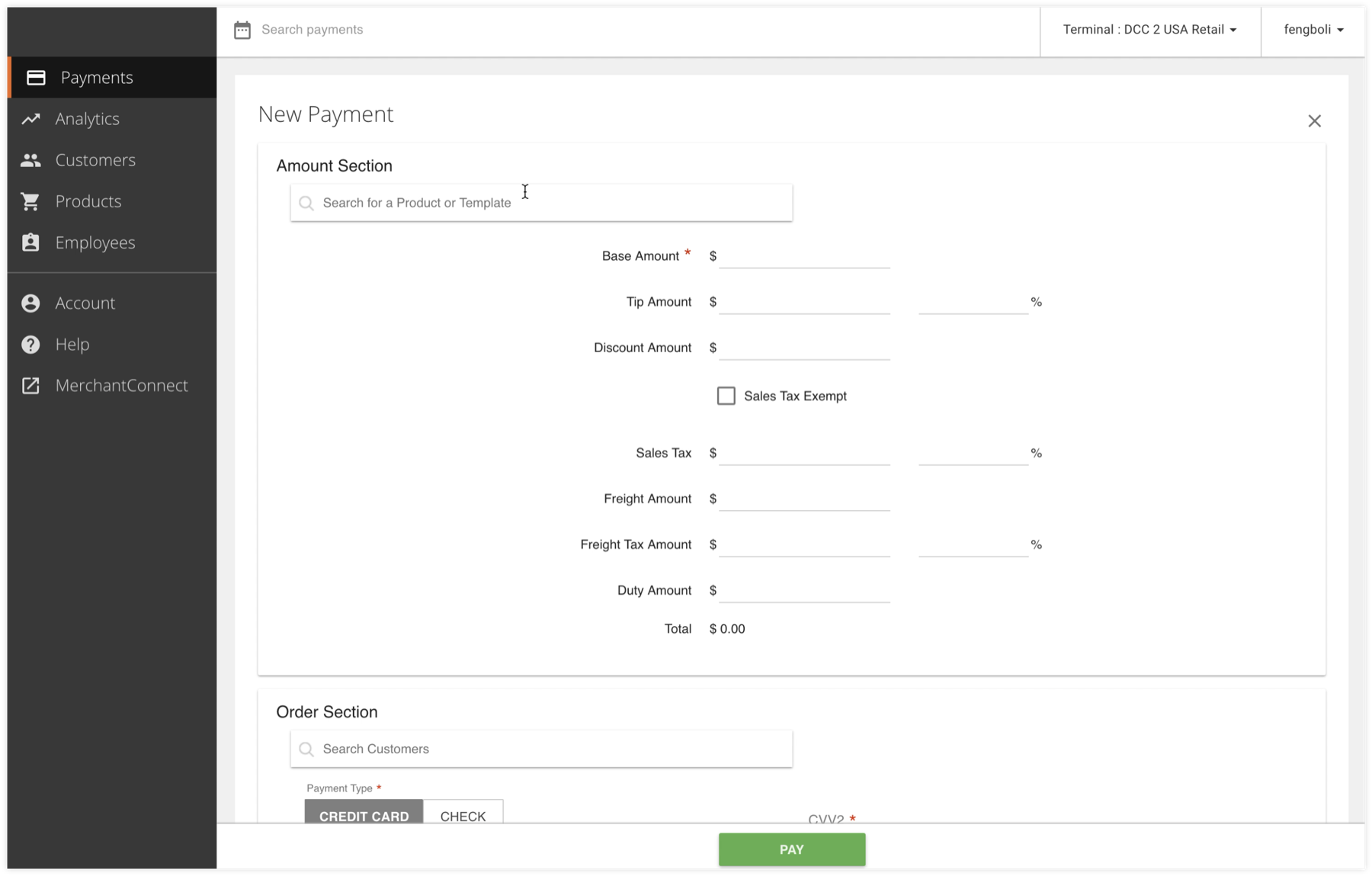
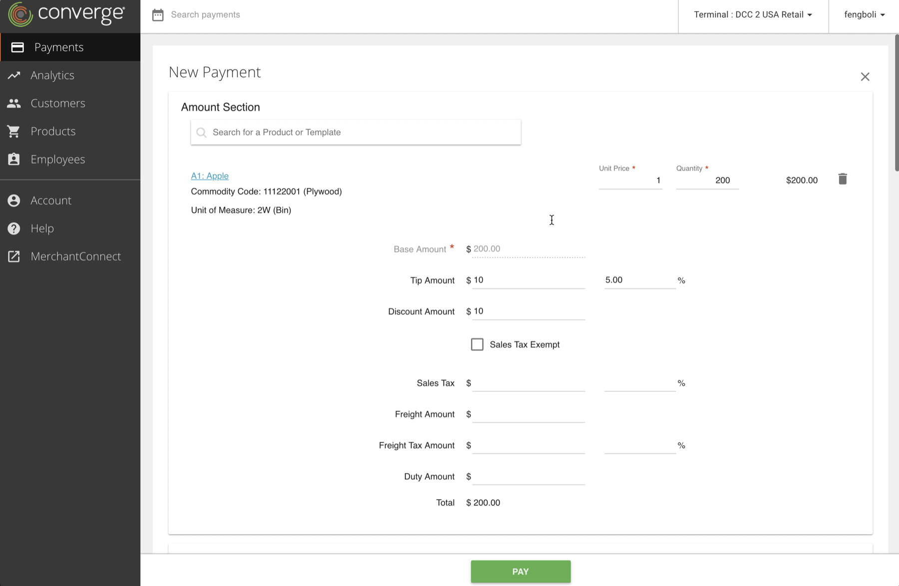
1.3 Product Catalog empowers merchants to quickly initiate a sale without manually enter item name and price, and easily track what they are selling.
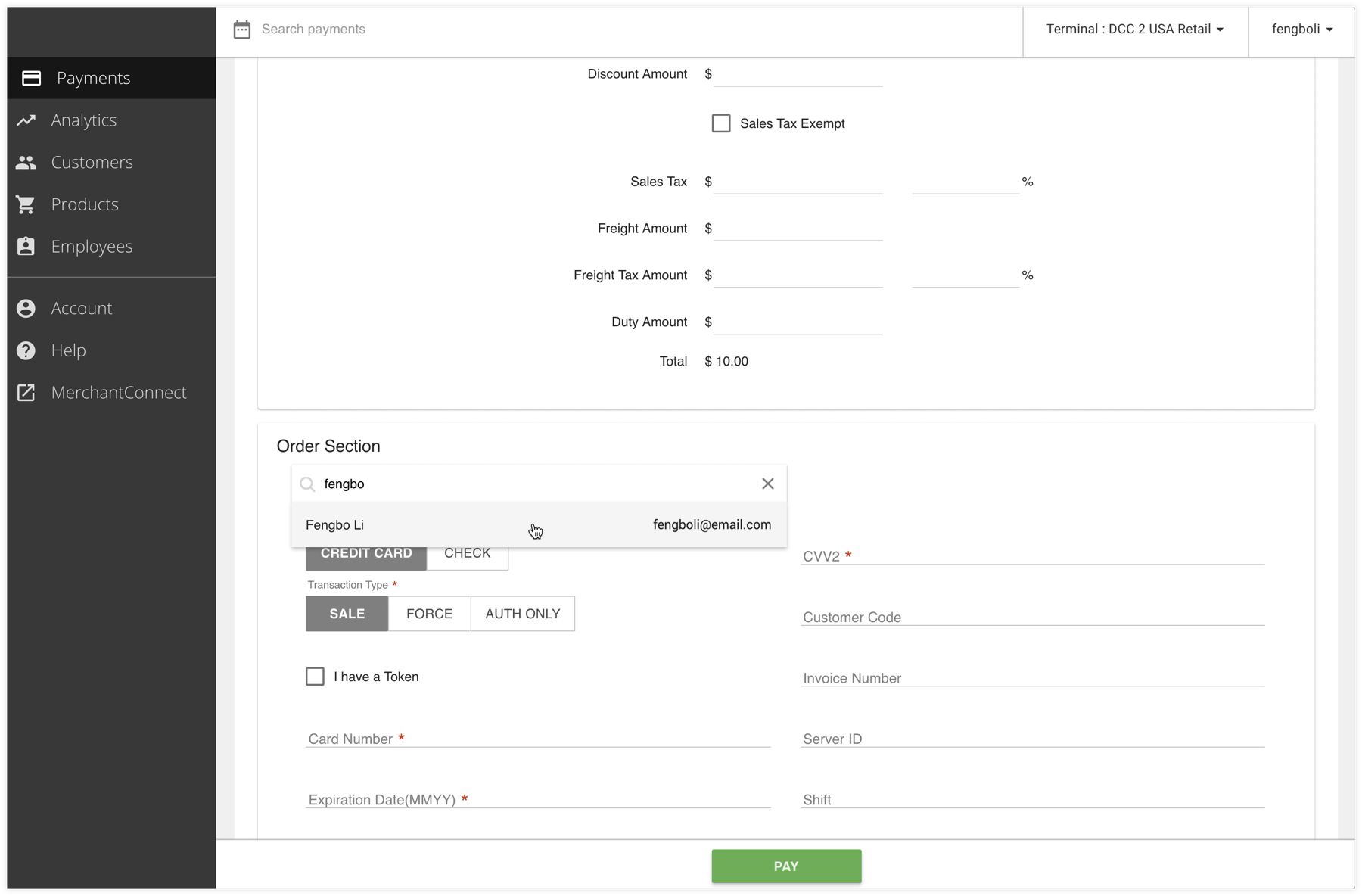
1.4 Customer management frees merchants from repetitive input. It stores customer information, merchants can easily search and load customer data information without typing everything again.
1.5 Readable user managment page with user template capability. We changed the UI to make it easier on the eyes, and users can "tab" through each user right without clicking on them. We also introduced smart default and user rights template for merchants to easily assign user rights to employees.
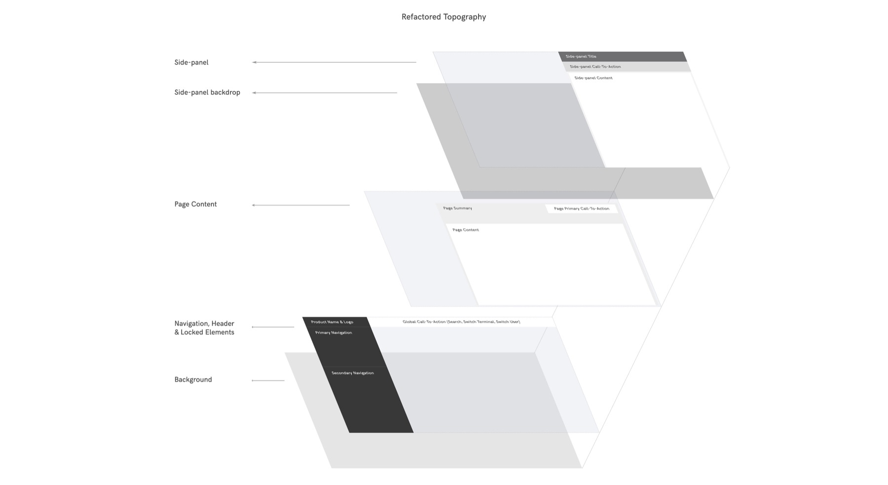
1.6 refactored site topography and information architecture to deliver clear navigation, reusable pattern and scalable system foundation.
Case Study 2: Redesign for Confidence, Autonomy, and Actionability
2.1 Distill key metrics merchants care about to help them quickly understand the overall performance of their business, without having to dig deep into the data table.
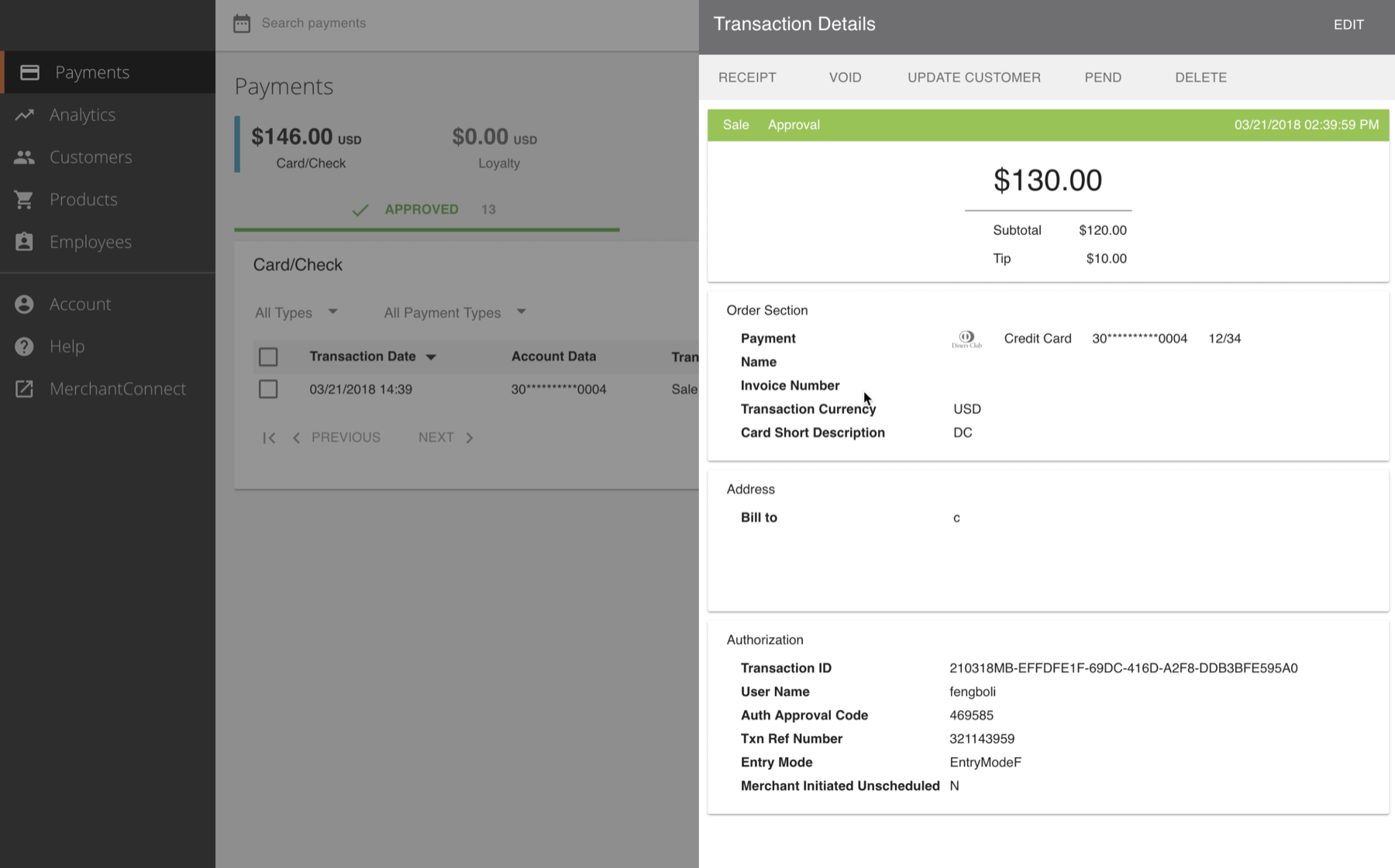
2.2 Provide context and details for merchants to make confident decisions. We moved the Call-To-Actions for a specific transaction onto the transaction detail page, which slides in as a side panel. Therefore, merchant can have essential transaction details to take an action (refund, void, delete a transaction) without losing context.
7. Impact
- Redesigned the core payment experience and shipped a few more new product feature, including customer managment, user management, invoicing. Enabled merchants to manage different aspects of their business using a single system. Significantly improved the product's usability and user satisfaction.
- Demonstrated the value of user experience, built trust and established the foundation for cross-disciplinary collaboration in an environment where dev team never worked with designers before.
- Collaboratively designed the merchant onboarding system, transformed the manual paperwork to a self-service online service, reduced the average time taken to open a merchant account from 9 days to 2 days.
8. Areas to improve
- Help merchant gather customer reviews: small businesses live and die by customer reviews, many of them are built on word of mouth. How might we encourage shoppers leave customer reviews after the sale and give merchants a chance to resolve the conflict if a negative review is submitted?
- Easy onboarding and integration experience: from signing up with a merchant account, to background check, to underwriting, to receiving payment devices, and to installing and activating the solution, it can take up to more than a week. How might we get merchants up to speed to take payment?
- Product and inventory management: Currently we only have a basic product catalog that allows merchants to track items for each transaction. How might we design a solution that helps merchants easily track, manage and update the inventory? And how might the solution provide business insights and help merchants make smarter decisions (e.g. what to sell)?
- More natural, human and smart way to manage a business: with the power of AI, machine learning, natural language processing, how might we assist merchants to more confidently run their business? Maybe at the end of the day, they can ask their bot assistant how their business is doing in human language, and the bot may provide insights on what sells well and you may consider reorder more.
- Chargeback handling: a chargeback happens when a customer disputes a charge on her credit card bill. In general, chargeback policies are designed to favour the consumer over the merchant. How might we help merchants reduce the risk of chargebacks and reduce the loss of the good and a chargeback fee?
9. The Challenges
1. Missing UX fundamentals and standards. There was little rationale baked in the product when it was built. There were also lack of consistency, design standards or visual hierarchy in the original product.
2. Lack of access and communication channels to talk to customers and users.
3. Various users from different industries (retail, service, government, etc.), ranging from small merchants to enterprises.
4. Need to build a scalable system for future product growth. While the original product has little flexibility and scalability.
5. Various dependencies that we have no control of. Our product sits in the middle of the credit card transaction processing chain. When the cardholder pays at the Point-Of-Sale (POS) for a purchase, the POS collects and sends the card information to our payment gateway, which forwards the card information to the credit card network (Visa, MasterCard, etc.), and then the credit card network requests payment authorization from the card issuing bank, the sends the result back to the POS.
10. Reflection
- As a product designer, we need to balance complexity and simplicity. We want to empower users to do whatever they want, which means more features, which increases the power, freedom, and flexibility we provide to users, which also makes the product more complex. While at the same time, we want to keep the product easy to use, so users don't get confused or have to make a whole lot of decisions.
- Follow conventions to meet users' expectations. Instead of representing the data model, the user interface should reflect users' mental model.
- Other than the user interface itself, so many things come into play to create a great user experience, such as infrastructure, information architecture, the process and people.
- User experience is much more than the interface, and design is much more than crafting pixels. Artifacts are the deliverables at the last phase of design. Design is the entire process of solving a meaningful problem that grounded in human needs and wants.